YouSurance

Bright, techy, and fun…

Is the general direction my team and I were given going into this rebuild of yousurance.com. Attitude aside, it also needs to get across what we do and how we do it.

What we do and how we do it

This company’s mission is to make buying life insurance suck less– a staggeringly tall order but we have an incredibly effective technical ace up our sleeve based on epigenetic research. The exact nature of our tech is a rabbits hole I don’t want to get into here but this page on their site does a nice job covering the “how” aspect.

How’d we pull it off?

Teamwork. I know it’s a bit of a cliche but you might say the same thing about this “gravity” thing always being the number one suspect whenever anything falls over, beating out even clumsiness. I think what falls flat on the “teamwork” statement for me is lack of credit for specifics, it’s hard to appreciate what everybody puts in when nobody tells you who put in what ingredients to whip up a really cool website.

So, let’s look at whodunnit

  1. One person found a cool looking but poorly functioning template.
  2. I took apart and rebuilt the template on a more flexible tech stack.
  3. Some QA testers did very creative and interesting things to the site to see if they could make it break or look weird.
  4. A whole slue of other peeps took point on actually writing our rundown on how the company works.
  5. We all met up routinely to show off our latest work and make sure it was on-point with what everybody else was making.

There you have it, that’s how the website came to be!


Improbability Drive

Need a 10,000 random magical effects for a D&D game?

Gotcha covered!

There’s this thing called the Wild Magic Surge table which crops up occasionally in a given game of Dungeons and Dragons which causes about 50 differing magical effects such as shielding yourself or exploding but it has a cooler big brother with 10 thousand possibilities! Thing is this list is kind of a pain, selecting a random event from 10,000 possibilities is a bit of a hassle with just normal dice.

Enter my web app you can check out here.

Click the big friendly button and get your wacky new spell effect!

How’s it work?

So glad you asked, dear reader. All it does is read a local JSON file containing the 10,000 magical effects, pick one at random, and feed it into the spot where {EFFECT POPS UP HERE} starts off.

It’s bloody simple and doesn’t get much more user friendly than that.

Wanna check out the source code? Got you covered.

Based on The Net Libram of Random Magical Effects v2 by Orrex

Update

I made a re-skin of the application and have it rolling the standard 100 wild magic effects, see it in action here.

Wild magic application reskinned to look like it was from Stranger Things
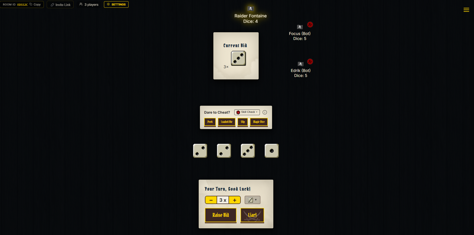
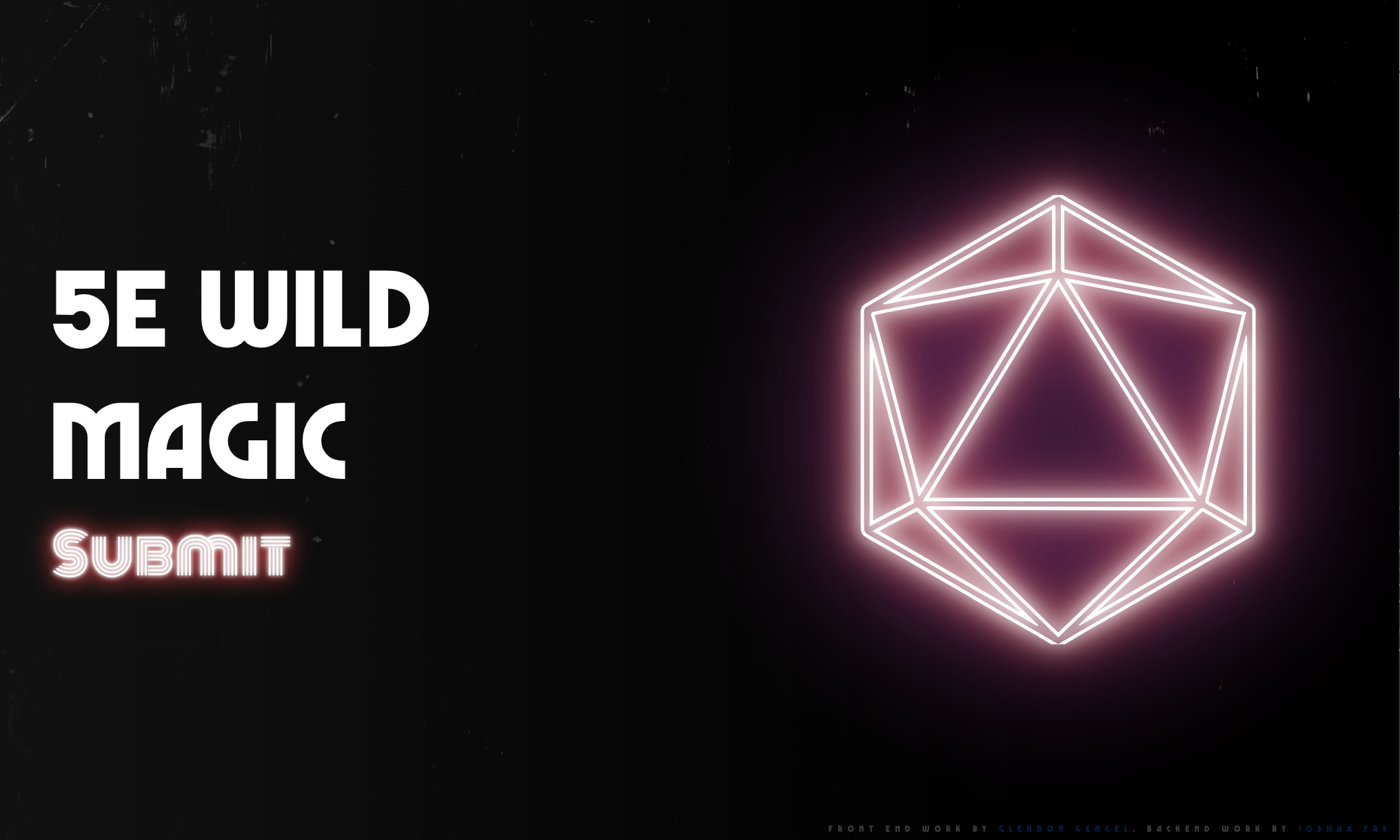
I had the bright idea that a D&D-based application was a damn good fit for that gritty laser effect Stranger Things did in their intro sequence paired up with a font called Marvin Visions, check it out and download it for free here!


To Do List

What’s it?

It’s a device I made/ programmed to display what movies I need to check out, chores I’m neglecting, what side projects I’ve ginned up to keep myself entertained.

Wanna see it running?

Of course you do!

Uh why?

Glen you fiendishly handsome devil, why do you need something like this? Well my flattering reader I do occasionally find myself watching a season of Rick & Morty that I’ve seen so many times I could probably rattle off the lines easier than the pledge of allegiance while guiltily thinking “aren’t there about a million things I want to check out right now, why can’t I remember a single one of them?”. I built this machine to stop myself from aimlessly slouching around on the couch… and because it looks super fly in my living room.

How’s it work (without mentioning a lick of actual code)?

Finer details can be found here in the repo

  1. A bit of code asks a Google sheet of mine for its contents
  2. Google feeds back the spreadsheet data to the code
  3. Another part of the code spits out the spreadsheet data as a neat little website
  4. Rinse and repeat every 15 minutes

Heavy-duty design or coding details

This is my testing ground for interesting layouts, new font usage, and seeing if I can make certain colors work together so the overall theme is “whatever looks cool”. If you refresh the list, a new theme will pop up. At the point in time I’m writing this, there are 3 different themes it cycles through on refresh.

Case design

custom etched to do list computer case

That’s a hand-drawn, laser engraved chunk of wood covering the front so buckle up kiddo, it’s a bit of a story.

Why “Calling You Home”?

So my brother and I were chilling out (possibly watching Rick & Morty again) and he remarked that my house had good vibes out the yin-yang… well what he actually said was that my house felt like a song by Seven Lions titled “Calling You Home” which he played for me and lemme tell ya, having the apartment I’ve put together compared to that song was one of the highest compliments I’ve ever been given.

After hearing it, I knew I would have to work that song into my home somewhere and being that I was already fixated on building a cool case for my motivational gizmo, I had a good idea of where it would end up. The only question left was how to make something which felt like that song and the case design you see is my answer.

Laser engraving

Did the engraving myself, I totally went out and got trained on how to work a big ol’ laser at a maker space called TC Maker (shout out!) in the twin cities.

How’d I code this beast?

The easiest way to explain is to check out the repo, in specific this file is where the party’s at.

The code work was probably the easiest part of this project as most of what I consider the tricky stuff was grabbed from an earlier project of mine so most of the focus was on making the code as easy to read as possible so the main custom.js file is TRICKED OUT with comments on what each line is doing.

Walk me through the steps, this time nerd it up!

You asked for it…

  1. Make call to Sheets API
  2. Wipe out any pre-existing cards
  3. Assign variable to JSON response length (var y)
  4. Create a card for each data set
  5. Fill the card with the corresponding data in an unordered list
  6. Do the whole song and dance again every 15 minutes
  7. Swap theme every 8 hours or so by randomly selecting a class from an array
  8. Remove old theme class
  9. Apply new theme class

TL;DR

I made a super techy and slick looking to-do list


Charts Made From Sheets

There was no good how-to on making a responsive chart that pulls its data from a spreadsheet

So I made one!

Why this is useful: responsive web data visualization turns out to be a bigger headache than I was expecting with many plugins that claim to do the job but don’t. I really wanted some slick looking graphs for a client that anybody could edit so I decided to go build something from scratch.

The lynch pins that make all of this possible are Google Sheets API and Google Visualizations.

Sheets

Sheets uses a a simple URL query structure that only really needs an API key and the ID of the sheet you want to pull data from though I do add on a parameter to specify the cell range that should be grabbed.

Here’s that the URL query looks like: https://sheets.googleapis.com/v4/spreadsheets/155Ec2P5W4_9KROYbM3oyHJaUQLH9_THzQLZXjVyTn70/values/Sheet1!A1:A7/?key=AIzaSyAHqTdQfwbPHiEA1KF7VsYyPF0ZjBA4qVs kinda ugly, huh? Well it’s actually pretty quick and to the point– the first long string of gibberish is the sheet ID, the “/values/Sheet1!A1:A7/” specifies the cells to grab and the query at the end specifies the API token– the rest doesn’t change between sheets which makes much less of a headache than some API’s (looking at you Spotify!).

Visualizations

I’m not sure exactly what Google Visualizations would be considered, be it a program, framework, or formatting markup but the important thing is I can feed it data and it will throw back a shnazzy graph. You can specify a bunch of handy formatting options such as chart type, color of the graph, data ranges, and a whole bunch of other thing anybody who has ever built a chart in MS Word or Excel would be familiar with immediately. Unfortunately, there is one feature totally missing from this otherwise wonderful widget and it’s the ability to make the chart different sizes when viewed on different devices…

Make it responsive

The trick was to not declare a chart width in the chart’s JavaScript then create a chart resize function which triggers a half second after the screen has been resized. Why a half second, you ask? Turns out if you don’t have a small delay when drawing the chart the function will trigger for every pixel you change the screen width making it lag out if you are sliding the screen size around in a browser window.

The source for your viewing pleasure

Click here


Hello Lindsay

The friendliest website I have ever worked on

http://hellolindsayjoy.com/ is by far the most interactive, inviting, and easy to use site I have worked on to date. What makes this one stand out? The function of the site is to get people talking with each other. The subjects discussed tend to fall into the categories of family, travel, business, and style with a tone of empowerment and entrepreneurship.

There are 2 parts of this site that stick out to me as a web designer for how fun they were to work on. In specific, they are the logo/ site identity and the user interaction (both the poster and the commenters)

Coming up with a look and feel

I was caught off guard when I started talking to Lindsay about her site for the simple fact she was well prepared and knew what she wanted! I’m so used to people approaching me with an idea along the lines of “My site looks like dried up cat vomit– help!”. Lindsay did her homework and gave me the words “joy, motivation, adventure, inspire, and funny” to work around along with great examples of the visual style she wanted, the general content flow of the site, and she even knew which themes would make a good starting point to boot!

The first part of the job was to come up with a logo we could base the rest of the site around. I have to admit, I was a little nervous about my first set of logo designs as most of my professional work is used for law firms and construction companies which is a totally different look and feel, however she found one in the first batch that fit her!

I honestly can’t figure out how to describe the attitude of the logo. The way I came up with it is similar to how musicians can hear a bunch of music from a genre and then start making music along the same lines without necessarily being able to explain how it worked. Lindsay gave me enough “music” I was able to start making it myself.

After the logo was picked, the rest of the styling naturally fell into place.

Interaction

Not only was this site a different flavor in terms of look and feel but also in how the owner is going to use it. I generally build sites to be friendly to other developers who might need to go in and make changes to the template source and the general page content does not change much from year to year. In this case I designed this site to be as friendly as possible when it comes to making and tagging posts, adding new menu items, or making minor changes to the layout.

The key thing I did differently was I took an existing, well defined theme (Perle) and did as much design work as I could through the built in customizer “appearance > customize” instead of my usual method which is to take a blank framework theme (usually FoundationPress) and build up the site’s structure from scratch.

The ease of use carries over into the posts themselves which are based around a big picture with text over it and then the content beneath. All the user has to do is select a featured image for their post and title it and the theme takes care of the rest (with the help of RevSlider).

In a nutshell, the site is set up so all you have to do is worry about content and conversation with the visitors.

Speaking of visitors, I had never worked on a site designed to have an active comments section so learning about moderator practices has been an adventure. All I have seen outside of well thought out and friendly posts is spam which does not make it through the post approval process. As of when I am writing this, I’m weighing the pros and cons of adding Captcha to the comments section to cut down the spam that is making it to the approve/ disapprove stage. I’m hesitant because Captcha feels like something which makes the user spend unnecessary effort to interact with the site which is bad UX. Option 2 is to try a honeypot (a neat little hidden robot trap) and see if I can keep spammers away by that means.

I suppose this article is quite wordy for something which can be summed up as “Made a cool looking and friendly website for a really nice person” but I’m just wordy like that.


Invite

This is one of the few times somebody told me to “go wild” on a project and they were not disappointed.

The project was simply to make the coolest high school graduation invitation I could. Given those directions, I found it safe to abandon my usual rule of trying to figure out what the other person is picturing and just have fun with it.

The letters were generated in Cinema 4d and exported with some cool trick that made it so you cold select just the letters in Photoshop without mucking about with pen tools, wands, and other selection tools.

The actual model in the photo was extracted from one of her senior photos with the good ol’ pen tool and then using some light smudging to take the edge off the extraction borders.

Background elements are mostly brush effects with outer glow effects thrown in for good measure.


Coinmarket API

I built a thing which stores and displays digital currency market data

Grab the repo and mess around with it here: https://github.com/haa-gg/Coin-Market-API-Example

More specifically, the goal is to create a script which talks to the Coin Market API (https://api.coinmarketcap.com/v1/ticker/) Note: this is a deprecated API and doesn’t work anymore, gets the relevant data for all 1000-something digital currencies out in the wild and puts the current values into a SQL database that I can refrence later. The live feed was more of a bi-product that I got attached to.

The heavy lifting of this project was to set up a database, write a SQL command to input the relevant data from the API into the database, then set the command to run once a day by means of a cron job.

Here’s the code you need to make the live feed section work, all neat n’ tidy

index.php

Here’s what makes the back end tick:

dbupdate.php (where the real action is)


Evite

Knowing people are invited is the major function

But if that were the only function, then why not 12 point Times New Roman? The other purpose this invitation serves is to give an idea of what Sage is all about– why you would want to meet them at this booth.

The reason is glass. Sage creates an incredibly striking and energy efficient glass that you can control the tint on with the flick of a switch– pretty neat, eh? The invitation works to clue the reader in as to whether they should talk to Sage based on how relevant the product is to them.

If the products are up their alley, they read below for the specifics.


Olafsen Ethics

The Olafsen Ethics Symposium

Is an event held up at UND every year with the intention of demonstrating ethics in business. It was my job to put together a promotional poster for the event and the only specifications I had were to get across the speakers name, and key event info (date, purpose, relevance).

The business administration turned me loose after that and what I decided was the most key information was what this speaker had done. Creating 1.6 million glasses just to help people out catches your attention and gives the reader an idea of what the presentation is going to be about.

I made the whole thing pop by using high contrast colors, a sharp font, and a clear hierarchy of information.


This Site

I feel like I’m trying to describe a person…

Sounds easy for a second but then the fact people are pretty complicated settles in and you’re left feeling a bit overwhelmed. That’s the feeling I’m having as I write this– I’m very familiar with my own site but figuring out what information people are really interested in is a bit of a challenge. For this reason, this description will be broken down into 2 sections, the first dealing with all of the conceptual things like basic organization structure, look, and feel while section 2 will deal with the notable bits of tech wich make this whole site go.

Conceptual

Functions

The goal of this site was to show people what I am capable of in regards to my profession which bounces between graphic designer, web developer, and web designer depending on client needs. For that reason, the site was pretty easy to break down into smaller, common sense areas of focus.

Look and Feel

Musicians always seem to have the most fun with what represents them visually– T-shirts, posters, album covers, and of course, websites. I wanted to have a bit of that fun while still acknowledging my non-musical profession and keeping things pretty sharp and intuitive to use.

With a general direction in mind, it was off to the internet to see if any musicians had put together something which fit the bill. After bouncing around a bit, I realized the middlepoint was music applications such as Spotify or Soundcloud– a place where people were showing off their creative side through a clean, functional, and intuitive interface!

I took that general concept and ran with it– looking over different album covers to get an idea of what my “logo” would be and how the site would lay out on each device. After bouncing my concpets off a few helpful friends and family, it was time for some coding!

Technical

Post Types

The first area I though would be interesting was in making each individual project I worked on into a custom post category– either web development, graphic design, or web design which was just a matter of adding the “add category” button in the post menu.

Where the posts got more technical was in making the front page display only a featured post in each category.

Here’s what one of the front page loops looks like

	 1,
    'category_name' =>  'featured+web-development' 
);

$my_query = new WP_Query( $args );
while( $my_query->have_posts() ):
    $my_query->the_post();
    //the_title();
//the_post_thumbnail();
$url = wp_get_attachment_url( get_post_thumbnail_id($post->ID) );
echo '
'; endwhile; wp_reset_postdata(); ?>

The pages listing the projects specific to each category run off a similar loop displayed below:


'web-development' ); $my_query = new WP_Query( $args ); while( $my_query->have_posts() ): $my_query->the_post(); $url = wp_get_attachment_url( get_post_thumbnail_id($post->ID) ); echo '

'.get_the_title().'

'; endwhile; wp_reset_postdata(); ?>

I included the row classes because it has to be one of the most handy features in Flex Foundation, the small-up-x, medium-up-x, …etc automatically wrap columns down a “row” when they overflow on one line and can do so indefinitely.

Desktop Navigation

I had some fun with the SCSS on this! If you dig around the internet, there are quite a few tutorials on how to make a box animate on hover but 99% of what I found out in the wild did not work if the box was filled in with a solid background color (common example). I did find some animations which used box-shadow as the colored background animation layer this effect had serious flicker issues.

In the end, I wrote the animation from scratch and you can see an example of it on https://jsfiddle.net/0d3cjzbq/. I also have the menu loop and scss I used down here:

SCSS

 .logged-in{

    .desk-nav{
padding-top:2rem;
    }
  }

  .desk-nav{
    position:absolute;
    top:0;
    left:0;
    width:30%;
    z-index:100;
    @include mui-animation(slide(in,right));
  animation-duration: .5s; 

    .menu .active > a{
      background:#000;

    }

    ul{
      list-style-type:none;
      margin:0;


      li{
        margin:.5rem 0;
        display:block;

        a{
          background-color:#000;
          border-bottom:none;
          color:#fff;
          width:100%;
          max-width:300px;
          padding:.5rem 1rem;
          display:block;
          font-family:$serif;
          text-transform:uppercase;
          letter-spacing:.15rem;
  position:relative;
  overflow:hidden;
        } 

        a:hover, .menu .active > a:hover{
         // @include transition;
         background-color:transparent;   
        }

        a:after{
   transition: left ease-out 0.4s;
  content:"   ";
  width:100%;
  height:40px;
  display:flex;
  position:absolute;
  left:-100%;
  top:0px;
  z-index:-50;
 
}

&:nth-of-type(1) a:after{
background-color:$blue;
}

&:nth-of-type(2) a:after{
 background-color: #2a20f7;
}

&:nth-of-type(3) a:after{
 background-color: #6349ff;
}

&:nth-of-type(4) a:after{
  background-color:#e95fff;
}

&:nth-of-type(5) a:after{
  background-color: #ffb526;
}

&:nth-of-type(6) a:after{
  background-color: #ffe200;
}
}


a:hover:after{
  left:0;
}

      }
    }

Loop

 'menu_order', 'container_class' => 'menu-header')); ?>

The finished product…

…Is right in front of you, let me know what you think!


Website copyright 2023. All rights reser-- Nah, I'm just playing with ya, the whole thing is up on an open repo on github!

Feel free to use it, break it, fix it, trash it, change it, mail, upgrate it.