Hello Lindsay
The friendliest website I have ever worked on
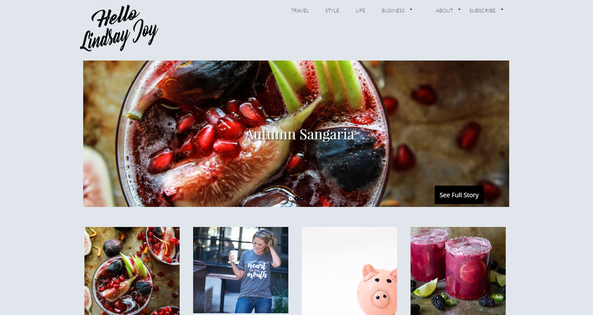
http://hellolindsayjoy.com/ is by far the most interactive, inviting, and easy to use site I have worked on to date. What makes this one stand out? The function of the site is to get people talking with each other. The subjects discussed tend to fall into the categories of family, travel, business, and style with a tone of empowerment and entrepreneurship.
There are 2 parts of this site that stick out to me as a web designer for how fun they were to work on. In specific, they are the logo/ site identity and the user interaction (both the poster and the commenters)
Coming up with a look and feel
I was caught off guard when I started talking to Lindsay about her site for the simple fact she was well prepared and knew what she wanted! I’m so used to people approaching me with an idea along the lines of “My site looks like dried up cat vomit– help!”. Lindsay did her homework and gave me the words “joy, motivation, adventure, inspire, and funny” to work around along with great examples of the visual style she wanted, the general content flow of the site, and she even knew which themes would make a good starting point to boot!
The first part of the job was to come up with a logo we could base the rest of the site around. I have to admit, I was a little nervous about my first set of logo designs as most of my professional work is used for law firms and construction companies which is a totally different look and feel, however she found one in the first batch that fit her!
I honestly can’t figure out how to describe the attitude of the logo. The way I came up with it is similar to how musicians can hear a bunch of music from a genre and then start making music along the same lines without necessarily being able to explain how it worked. Lindsay gave me enough “music” I was able to start making it myself.
After the logo was picked, the rest of the styling naturally fell into place.
Interaction
Not only was this site a different flavor in terms of look and feel but also in how the owner is going to use it. I generally build sites to be friendly to other developers who might need to go in and make changes to the template source and the general page content does not change much from year to year. In this case I designed this site to be as friendly as possible when it comes to making and tagging posts, adding new menu items, or making minor changes to the layout.
The key thing I did differently was I took an existing, well defined theme (Perle) and did as much design work as I could through the built in customizer “appearance > customize” instead of my usual method which is to take a blank framework theme (usually FoundationPress) and build up the site’s structure from scratch.
The ease of use carries over into the posts themselves which are based around a big picture with text over it and then the content beneath. All the user has to do is select a featured image for their post and title it and the theme takes care of the rest (with the help of RevSlider).
In a nutshell, the site is set up so all you have to do is worry about content and conversation with the visitors.
Speaking of visitors, I had never worked on a site designed to have an active comments section so learning about moderator practices has been an adventure. All I have seen outside of well thought out and friendly posts is spam which does not make it through the post approval process. As of when I am writing this, I’m weighing the pros and cons of adding Captcha to the comments section to cut down the spam that is making it to the approve/ disapprove stage. I’m hesitant because Captcha feels like something which makes the user spend unnecessary effort to interact with the site which is bad UX. Option 2 is to try a honeypot (a neat little hidden robot trap) and see if I can keep spammers away by that means.
I suppose this article is quite wordy for something which can be summed up as “Made a cool looking and friendly website for a really nice person” but I’m just wordy like that.

