FOXO Technologies

What is it?

This is a B2B facing site I built to help promote a biotech/ insurtech startup called FOXO Technologies. The goal of the company is to make buying life insurance easier by way of eliminating the blood + urine test you need to take when applying for substantial life insurance policies by means of a mail-in spit test much like ancestory.com or 23 and Me use.

What makes it important?

This site is important to me because it took every once of talent I’ve built up in my decade of web development to bring it all together. The team that designed this had one of the most ambitious visions I’ve ever had the privilege of working with and they gave me a shot to bring it to life. Together we knocked it well out of the park and happily into orbit.

I love the scroll-based animations based on the animate-on-scroll library as well as the ultra crisp imagery which looks extra slick with the quiet addition of parallax effects by way of parallax.js

Biggest challenges?

  1. Learning tailwind on the fly– it’s a wonderful framework but hard to dive into when you have a tight deadline.
  2. Coordinating/ asking for another dev on a flagship site– during my time at FOXO my job has been considered intimidating because the public facing websites I build are scrutinized by the entire company as well as every potential investor who looks it over them so there had been little demand in terms of other devs who wanted to join forces and help me build new sites.

    That changed with the launch of the latest iteration of foxotechnologies.com because the design was next-level complex and the stakeholders wanted this done yesterday. Once I figured out the scope and scale I proposed adding another specialized contractor dev before we begin to really accelerate things and leadership was totally on board.

    Things worked out pretty smooth but it required much more use of git branches and pull requests which was good practice.

Want more?

Check out the B2C sibling site I helped develop, foxolife.com


YouSurance

Bright, techy, and fun…

Is the general direction my team and I were given going into this rebuild of yousurance.com (the live site is down so here’s a saved version of it). Attitude aside, it also needs to get across what we do and how we do it.

What we do and how we do it

This company’s mission is to make buying life insurance suck less– a staggeringly tall order but we have an incredibly effective technical ace up our sleeve based on epigenetic research. The exact nature of our tech is a rabbits hole I don’t want to get into here but this page on their site does a nice job covering the “how” aspect.

How’d we pull it off?

Teamwork. I know it’s a bit of a cliché but you might say the same thing about this “gravity” thing always being the number one suspect whenever anything falls over, beating out even clumsiness. I think what falls flat on the “teamwork” statement for me is lack of credit for specifics, it’s hard to appreciate what everybody puts in when nobody tells you who put in what ingredients to whip up a really cool website.

So, let’s look at whodunnit

  1. One person found a cool looking but poorly functioning template.
  2. I took apart and rebuilt the template on a more flexible tech stack.
  3. Some QA testers did very creative and interesting things to the site to see if they could make it break or look weird.
  4. A whole slue of other peeps took point on actually writing our rundown on how the company works.
  5. We all met up routinely to show off our latest work and make sure it was on-point with what everybody else was making.

There you have it, that’s how the website came to be!


To Do List

What’s it?

It’s a device I made/ programmed to display what movies I need to check out, chores I’m neglecting, what side projects I’ve ginned up to keep myself entertained.

Wanna see it running?

Of course you do!

Uh why?

Glen you fiendishly handsome devil, why do you need something like this? Well my flattering reader I do occasionally find myself watching a season of Rick & Morty that I’ve seen so many times I could probably rattle off the lines easier than the pledge of allegiance while guiltily thinking “aren’t there about a million things I want to check out right now, why can’t I remember a single one of them?”. I built this machine to stop myself from aimlessly slouching around on the couch… and because it looks super fly in my living room.

How’s it work (without mentioning a lick of actual code)?

Finer details can be found here in the repo

  1. A bit of code asks a Google sheet of mine for its contents
  2. Google feeds back the spreadsheet data to the code
  3. Another part of the code spits out the spreadsheet data as a neat little website
  4. Rinse and repeat every 15 minutes

Heavy-duty design or coding details

This is my testing ground for interesting layouts, new font usage, and seeing if I can make certain colors work together so the overall theme is “whatever looks cool”. If you refresh the list, a new theme will pop up. At the point in time I’m writing this, there are 3 different themes it cycles through on refresh.

Case design

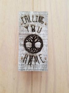
custom etched to do list computer case

That’s a hand-drawn, laser engraved chunk of wood covering the front so buckle up kiddo, it’s a bit of a story.

Why “Calling You Home”?

So my brother and I were chilling out (possibly watching Rick & Morty again) and he remarked that my house had good vibes out the yin-yang… well what he actually said was that my house felt like a song by Seven Lions titled “Calling You Home” which he played for me and lemme tell ya, having the apartment I’ve put together compared to that song was one of the highest compliments I’ve ever been given.

After hearing it, I knew I would have to work that song into my home somewhere and being that I was already fixated on building a cool case for my motivational gizmo, I had a good idea of where it would end up. The only question left was how to make something which felt like that song and the case design you see is my answer.

Laser engraving

Did the engraving myself, I totally went out and got trained on how to work a big ol’ laser at a maker space called TC Maker (shout out!) in the twin cities.

How’d I code this beast?

The easiest way to explain is to check out the repo, in specific this file is where the party’s at.

The code work was probably the easiest part of this project as most of what I consider the tricky stuff was grabbed from an earlier project of mine so most of the focus was on making the code as easy to read as possible so the main custom.js file is TRICKED OUT with comments on what each line is doing.

Walk me through the steps, this time nerd it up!

You asked for it…

  1. Make call to Sheets API
  2. Wipe out any pre-existing cards
  3. Assign variable to JSON response length (var y)
  4. Create a card for each data set
  5. Fill the card with the corresponding data in an unordered list
  6. Do the whole song and dance again every 15 minutes
  7. Swap theme every 8 hours or so by randomly selecting a class from an array
  8. Remove old theme class
  9. Apply new theme class

TL;DR

I made a super techy and slick looking to-do list


Auto Srcset

A Handy Little Widget That Builds And Loads Images Based On Device Width

So there’s this nifty little property in HTML that will let the browser determine which size image to load based on how large it needs to display it. The only hassle is that these images are tedious to build since without any automation, you have to save each image at each different size. This is about as much fun as cleaning out an attic full of bats with an air horn so I came up with a handy way to make the computer do all the heavy lifting for me (now if only I could make it deal with the bats…).

In a nutshell, my widget uses a single line in a command prompt to trigger a process which feeds all images in a directory through a program called GraphicsMagic that resizes it to your specifications and outputs the images to their own directory. Once we have the image files, we can easily reference all of them using a simple PHP function detailed below.

Now for the nitty gritty on how each bit works!

Gulp/ Node Package Manager

The dependencies are crazy simple, this is all you need in your package.json

{
  "name": "RespImg",
  "version": "1.0.0",
  "description": "Image Sizing Example",
  "main": "index.js",
  "scripts": {
    "test": "echo \"Error: no test specified\" && exit 1"
  },
  "author": "glen",
  "license": "ISC",
  "devDependencies": {
   
    "gulp": "^3.9.1",
    "gulp-concat": "^2.6.0",
    "gulp-responsive-images": "*"
    
  }
}

All our NPM does is download Gulp, Gulp Concat (not necessary), and the responsive image plugin (you do need to manually download the binaries though).

As for our Gulp file, the basic setup is really simple:

var gulp = require('gulp');
var responsive = require('gulp-responsive-images');
 
gulp.task('responsive-img', function () {
  gulp.src('assets/images/*.{png,gif,jpg}')
    .pipe(responsive({
       '*': [{
        width: 300,
        suffix: '-s'
      }, {
        width: 500,
        suffix: '-m'
      }, {
        width: 600,
        suffix: '-l'
      }],
      
    }))
    .pipe(gulp.dest('assets/images/adaptive'));
});

If you open a command line in your project folder after the NPM install and type “gulp responsive-img” it will generate new copies of all images in our specified folder!

Handy Dandy PHP Function

We still need a good way of writing all the mind numbing srcset markup which is where my PHP function comes into play!


             class="responsive"
                     alt="Some text"/>


If you have any interest in a working set of files, you can download them here!


Construction LP

Midas is not a real company

But I like to imagine they would be quite happy to use this as a landing page on their AdWords campaign.

The goal is to give the impression of quality service without going overboard and coming off too spendy. I think I hit a nice middle ground with lots of neutral tones and a classy set of bathroom photos all in the same color palette.

Functionality wise, we have strong reasons to trust the company above the fold and a solid call to action above the fold as well. As the viewer scrolls down, they get more reasons to trust the company followed by another call to action in the form of a contact form I am quite proud of!

Overall, one of my favorite pieces for blending style and function in a way that leaves me and the client very happy!

If you want to see the page in action, check out: https://designerofstuff.com/example-contractor-landing-page/.


Econ Poster

Economics turns out to be pretty darn cool

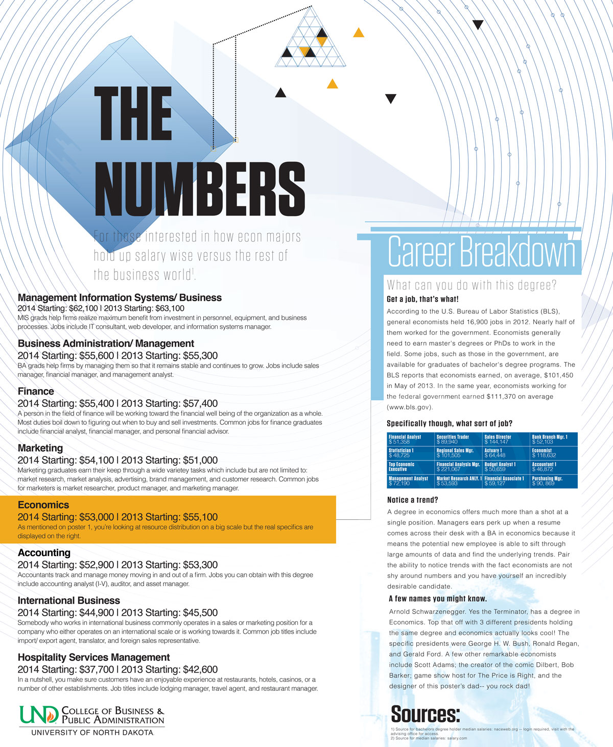
Not something I would have pictured being particularly exciting… useful certainly but not something I would expect to throw myself into full tilt and make a set of posters that I feel would fit right into Wired magazine. I was assigned by the UND business department to make a set of posters around the theme of economics to fill an oddly shaped set of frames, those specs aside I was given free reign.

I started off by digging around for the fundamentals– what is it in a few short words then working outward. Turns out the field is highly specialized and an actual job position as an economist is pretty darn rare which gives the impression there is a glut of economics degree holders with no jobs they are well equipped for but this is not the case. Turns out the econ classes train people really well to handle large data sets such as market research, accountants, and fiinancial analysts.

After finding out these guys deal with big data, my intereest really piqued since abstraction of big data sets looks really cool to me! Seeing a general trend for the poster set, I got to work selecting fonts and coming up with graphic assets that fit the theme.

After assembling a good set of assets came a seemingly endless series of revisions from the staff as well as myself but in the end, there were high-fives all around when the final prints came out.

Here’s the second poster

Economics Poster 2

Want the print sized versions? Check them out down below!

Hi Res Part 1

Hi Res Part 2


Action Roofing

A clean, sharp, and functional site

http://actionroofing.net/ was just a treat to work on. The goal we were given was to make something professional that shows off the roofing and siding work the company does. We used their existing color palette of red, black, white and gray tones to put together a set of mock ups which took only a couple sets of minor revisions before everybody was happy with the layout.

Coding wise, the site is built off JointsWP– a really clean framework for WordPress themes that has Foundation baked into it right from the get go. The site makes use of the data equalizer feature in Foundation which allows you to generate divs of equal height via JavaScript which makes it more friendly to the older browsers than the newer JS-free flex options.


Website copyright 2024. All rights reser-- Nah, I'm just playing with ya, the whole thing is up on an open repo on github!

Feel free to use it, break it, fix it, trash it, change it, mail, upgrate it.