Auto Srcset
A Handy Little Widget That Builds And Loads Images Based On Device Width
So there’s this nifty little property in HTML that will let the browser determine which size image to load based on how large it needs to display it. The only hassle is that these images are tedious to build since without any automation, you have to save each image at each different size. This is about as much fun as cleaning out an attic full of bats with an air horn so I came up with a handy way to make the computer do all the heavy lifting for me (now if only I could make it deal with the bats…).
In a nutshell, my widget uses a single line in a command prompt to trigger a process which feeds all images in a directory through a program called GraphicsMagic that resizes it to your specifications and outputs the images to their own directory. Once we have the image files, we can easily reference all of them using a simple PHP function detailed below.
Now for the nitty gritty on how each bit works!
Gulp/ Node Package Manager
The dependencies are crazy simple, this is all you need in your package.json
{
  "name": "RespImg",
  "version": "1.0.0",
  "description": "Image Sizing Example",
  "main": "index.js",
  "scripts": {
    "test": "echo \"Error: no test specified\" && exit 1"
  },
  "author": "glen",
  "license": "ISC",
  "devDependencies": {

    "gulp": "^3.9.1",
    "gulp-concat": "^2.6.0",
    "gulp-responsive-images": "*"

  }
}
All our NPM does is download Gulp, Gulp Concat (not necessary), and the responsive image plugin (you do need to manually download the binaries though).
As for our Gulp file, the basic setup is really simple:
var gulp = require('gulp');
var responsive = require('gulp-responsive-images');

gulp.task('responsive-img', function () {
  gulp.src('assets/images/*.{png,gif,jpg}')
    .pipe(responsive({
       '*': [{
        width: 300,
        suffix: '-s'
      }, {
        width: 500,
        suffix: '-m'
      }, {
        width: 600,
        suffix: '-l'
      }],

    }))
    .pipe(gulp.dest('assets/images/adaptive'));
});
If you open a command line in your project folder after the NPM install and type “gulp responsive-img” it will generate new copies of all images in our specified folder!
Handy Dandy PHP Function
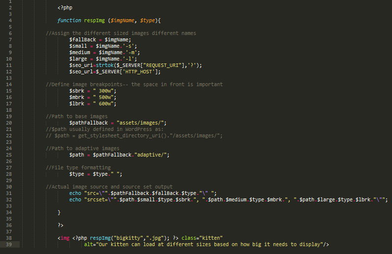
We still need a good way of writing all the mind numbing srcset markup which is where my PHP function comes into play!
![]() class="responsive"
alt="Some text"/>
             class="responsive"
                     alt="Some text"/>
If you have any interest in a working set of files, you can download them here!

