Window LP
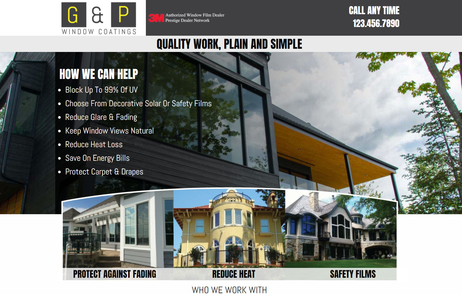
G & P Windows feels clean, functional, and to the point
The photos of their work should do most of the talking while the rest of the page words to fill the reader in on the specifics of how the product works and establish a sense of trust.
From a design perspective, the project was quite straight forward: send over some inital mockups to get us talking, adjust the mockups till everybody is happy then move it all into code.
On the coding side, the project was just a treat– the big sets of images played very will with Foundation and its lovely flex display properties. The SASS is really succinct, coming in at just over 400 lines which can be easily shark down to around 300 if I didn’t enjoy my line breaks so much! You can check that out below.
If you want to see the page in action, just head on over to: https://designerofstuff.com/example-window-landing-page/
  /*================================================================

Content stylesheet

================================================================*/


/*================================================================

Content Universal Styling

================================================================*/

.box {
  height: 310px;
  width: 210px;
  background-image: url('../images/flip1.jpg');
  background-size:cover;
  background-repeat:no-repeat;
  position: relative;
  overflow: hidden;
  border:5px solid #fff;
  margin:0 auto;
}

.overlay {
  background-image:url('../images/flip2.jpg');
  background-size:cover;
  background-repeat:no-repeat;
  height:300px;
  position: absolute;
  width: 100%;
  left: -270px;
  margin-left: 520px;
  bottom: 0;
  transition: left 400ms linear, margin-left 400ms ease-out;
}

.toggleClass{
  left: 0;
  margin-left: 0;
  transition: left 400ms ease-out;
}

.span-darkgray{
  background-color:$gray;
  color:#fff;
}

.span-lightgray{
  background-color:$lightgray;
}


body{
  font-family: 'Abel', sans-serif;
}

h1,h2,h3,h4,h5,h6{
  font-family: 'Anton', sans-serif;
}

.logo-wrap:before{
  content: " ";
  position: absolute;
  z-index: -20;
  top: 0;
  width: 9999rem;
  right: 74%;
  background: #fff;
  height: 100%;
}

.logo-wrap{

}

.header{
  position:relative;
  z-index:100;

  .bbb{
    width:70%;
    margin:0 auto;
    display:block;
  }

  h2{
    font-size:2.0rem;
    color:#fff;
    text-align:right;

    a{
      color:#fff;
      font-size:1.9rem;
      letter-spacing:0rem;
    }
  }
}

.r1-logo{
  position: relative;
  left: 0;
  -moz-animation-name: dropHeader;
  -moz-animation-iteration-count: 1;
  -moz-animation-timing-function: ease-out;
  -moz-animation-duration: 0.3s;
  -webkit-animation-name: dropHeader;
  -webkit-animation-iteration-count: 1;
  -webkit-animation-timing-function: ease-out;
  -webkit-animation-duration: 0.3s;
  animation-name: dropHeader;
  animation-iteration-count: 1;
  animation-timing-function: ease-out;
  animation-duration: 0.3s;
}

h1{
  font-size:2.5rem;
  text-align:center;
  margin-bottom:0;
}

.span-hero{
  background-image:url('../images/hero-bg.jpg');
  background-size:cover;
  background-repeat:no-repeat;
}

.hero{
  /* Permalink - use to edit and share this gradient: http://colorzilla.com/gradient-editor/#000000+0,1a2330+100&0.83+0,0+100 */
  background: -moz-linear-gradient(left,  rgba(0,0,0,0.83) 0%, rgba(26,35,48,0) 100%); /* FF3.6-15 */
  background: -webkit-linear-gradient(left,  rgba(0,0,0,0.83) 0%,rgba(26,35,48,0) 100%); /* Chrome10-25,Safari5.1-6 */
  background: linear-gradient(to right,  rgba(0,0,0,0.83) 0%,rgba(26,35,48,0) 100%); /* W3C, IE10+, FF16+, Chrome26+, Opera12+, Safari7+ */
  filter: progid:DXImageTransform.Microsoft.gradient( startColorstr='#d4000000', endColorstr='#001a2330',GradientType=1 ); /* IE6-9 */
  color:#fff;


  ul{
    font-size:1.8rem;
    line-height:130%;

    li{
      margin-bottom:10px;
    }
  }
}

.picbar{
  position:relative;

  .pic-qs{
    position:absolute;
    background-color:rgba(255,255,255,0.8);
    text-align:center;
    width:100%;
    bottom:0;
  }
}

.trust{
  p{
    font-size:2rem;
    text-align:center;
  }

  .trust-list{
    @include justify;
    list-style-type:none;

    .tall{
      max-width:120px;
    }

    .wide{
      max-width:200px;
    }
  }
}

.video{
  text-align:center;
  padding: 1rem 0;
}

.gallery{
  padding:1rem 0;
}

.testimonial{

  font-size:1.2rem;

  .test-wrap{
    background-color:$lightgray;
    padding:2rem 1rem;
    border-radius:8px;
    height:100%;
    display: -webkit-flex;
    display: flex;
    -webkit-justify-content: space-between;
    justify-content: space-between;
    -webkit-align-items: center;
    align-items: center;
    list-style: none;
    position:relative;
  }

  .test-wrap:after{
content:"";
    position:absolute;
    top:100%;
    left:25px;
    border-width:30px 30px 0 0;
    border-style:solid;
    border-color:$lightgray transparent;
    /* css3 extras */
    -webkit-transform:skewX(-15deg);
       -moz-transform:skewX(-15deg);
        -ms-transform:skewX(-15deg);
         -o-transform:skewX(-15deg);
            transform:skewX(-15deg);
  }
}

/*================================================================

Content Desktop Styling

================================================================*/

@media (min-width:1024px){
  .hero{
    padding-top:3rem;
    padding-bottom:7rem;
  }

  .offset{
    position:relative;
    top:-6rem;
  }

  .gal-pics{

    img{
      width:24.7%;
      margin:0;
      padding:0;
    }
  }

}


/*================================================================

Content Tablet Styling

================================================================*/
@media screen and (min-width: 40em) and (max-width: 63.9375em) {

  body{

  .picbar{

    .pic-qs{

      h3{
        font-size:1rem;
        padding:.5rem 0;
      }
    }
  }


  .tall{
    width:66%;
    margin:0 auto;
    display:block;
    padding-bottom:1rem;
  }


}

  }

/*================================================================

Content Mobile Styling

================================================================*/

@media (max-width:1023px){

.logo-wrap:before{
  content: " ";
  position: absolute;
  z-index: -20;
  top: 0;
  width: 9999rem;
  right: 60%;
  background: #fff;
  height: 100%;
}

.mobile-call{
padding:.5rem 0;
background-color:$lightgray;

  h2{
    margin-bottom:0;
    letter-spacing:.00rem;

    a{
      color:#000;
    }
  }
}

.headline{
  background-color:#fff;

  h1{
    font-size:1.5rem;
    text-align:left;
  }
}

.span-hero{
  background-image:url('../images/hero-bg-mobile.jpg');
  background-repeat:no-repeat;
  padding-top:15rem;

  .hero{
    background-color:rgba(0,0,0,.5);
    padding:.5rem .25rem;
  }

  .mob-qs{
    padding-left:1rem;

    h2{
      font-size:2rem;
      text-shadow:2px 2px 5px rgba(0,0,0,0.7);
    }

    ul{
      letter-spacing:.05rem;
      line-height:110%;
      font-size:1.2rem;

      li{
        margin-bottom:0px;
      }
    }
  }
}

.picbar{

  .columns{
    padding:0;
  }

  img{
    width:100%;
  }

  .pic-qs{

    h3{
    font-size:.8rem;
    margin-bottom:0;
  }

  .row{
    margin-right:0;
    margin-left:0;
  }
  }
}

.trust-imgs{

  ul{


    li{
      width:47%;
    }
  }
}

.video{
  .vid1{
    margin-bottom:1rem;
  }
}

.gal-pics{

    img{
      width:100%;
      margin:0;
      padding:0;

    }
  }
}

.testimonial{
  padding-top:1rem;

  .large-4{
margin-bottom:3rem;
  }
}