Charts Made From Sheets
There was no good how-to on making a responsive chart that pulls its data from a spreadsheet
Why this is useful: responsive web data visualization turns out to be a bigger headache than I was expecting with many plugins that claim to do the job but don’t. I really wanted some slick looking graphs for a client that anybody could edit so I decided to go build something from scratch.
The lynch pins that make all of this possible are Google Sheets API and Google Visualizations.
Sheets
Sheets uses a a simple URL query structure that only really needs an API key and the ID of the sheet you want to pull data from though I do add on a parameter to specify the cell range that should be grabbed.
Here’s that the URL query looks like: https://sheets.googleapis.com/v4/spreadsheets/155Ec2P5W4_9KROYbM3oyHJaUQLH9_THzQLZXjVyTn70/values/Sheet1!A1:A7/?key=AIzaSyAHqTdQfwbPHiEA1KF7VsYyPF0ZjBA4qVs kinda ugly, huh? Well it’s actually pretty quick and to the point– the first long string of gibberish is the sheet ID, the “/values/Sheet1!A1:A7/” specifies the cells to grab and the query at the end specifies the API token– the rest doesn’t change between sheets which makes much less of a headache than some API’s (looking at you Spotify!).
Visualizations
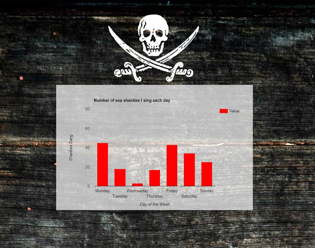
I’m not sure exactly what Google Visualizations would be considered, be it a program, framework, or formatting markup but the important thing is I can feed it data and it will throw back a shnazzy graph. You can specify a bunch of handy formatting options such as chart type, color of the graph, data ranges, and a whole bunch of other thing anybody who has ever built a chart in MS Word or Excel would be familiar with immediately. Unfortunately, there is one feature totally missing from this otherwise wonderful widget and it’s the ability to make the chart different sizes when viewed on different devices…
Make it responsive
The trick was to not declare a chart width in the chart’s JavaScript then create a chart resize function which triggers a half second after the screen has been resized. Why a half second, you ask? Turns out if you don’t have a small delay when drawing the chart the function will trigger for every pixel you change the screen width making it lag out if you are sliding the screen size around in a browser window.